
We're used to thinking of colours as fixed properties.
Red is red.
Blue is blue.
But that's not quite how our perception works.
The same shade can look lighter, darker, more intense or even slightly different depending on the light, the shadows and the colours around it.
That's why some optical illusions manage something baffling: two surfaces of the same colour can look completely different to us.
Why can the same colour look different?
The brain doesn't interpret each colour in isolation.
It's constantly comparing it with the rest of the scene.
The brightness of the surroundings, nearby colours and the presence of shadows all change how we perceive a surface.
This explains why a grey can look lighter on a dark background and darker on a light one, even though it's physically exactly the same.
This is known as simultaneous contrast.
An idea studied since the 19th century
The effect colours have on one another was studied systematically long before screens or digital photography existed.
In 1839, French chemist Michel-Eugène Chevreul published his work on the law of simultaneous contrast of colours, describing how our perception of a colour changes depending on the shades around it.
His observations influenced not only colour science, but also fields such as art, painting, design and the decorative arts.
The idea is still surprisingly relevant today: we don't simply see a colour; we see a colour within a context.
Our brain also tries to correct for lighting
There's another key mechanism too: colour constancy.
Thanks to it, we still recognise a T-shirt as blue whether we see it under the warm light of a bulb, the cool light of a cloudy day or next to a window.
The light that actually reaches our eyes changes, but the visual system tries to work out how much of that change comes from the lighting and how much from the object.
Without this ability, the colours of everything around us would seem to shift constantly throughout the day.
When that correction fools the brain
The problem arises when an image introduces lighting or shadow cues that lead the brain to make the wrong correction.
One of the best-known examples is the Checker Shadow Illusion, created by MIT professor Edward Adelson in 1995.
In it, two squares on a chessboard seem to be clearly different shades of grey.
Yet both are exactly the same shade in the image.
The difference appears because one of them sits inside an apparent shadow. The brain compensates for that supposed lack of light and ends up reading it as lighter than it really is.
It's a particularly clear demonstration that perceiving colour also means interpreting the lighting and the surroundings.
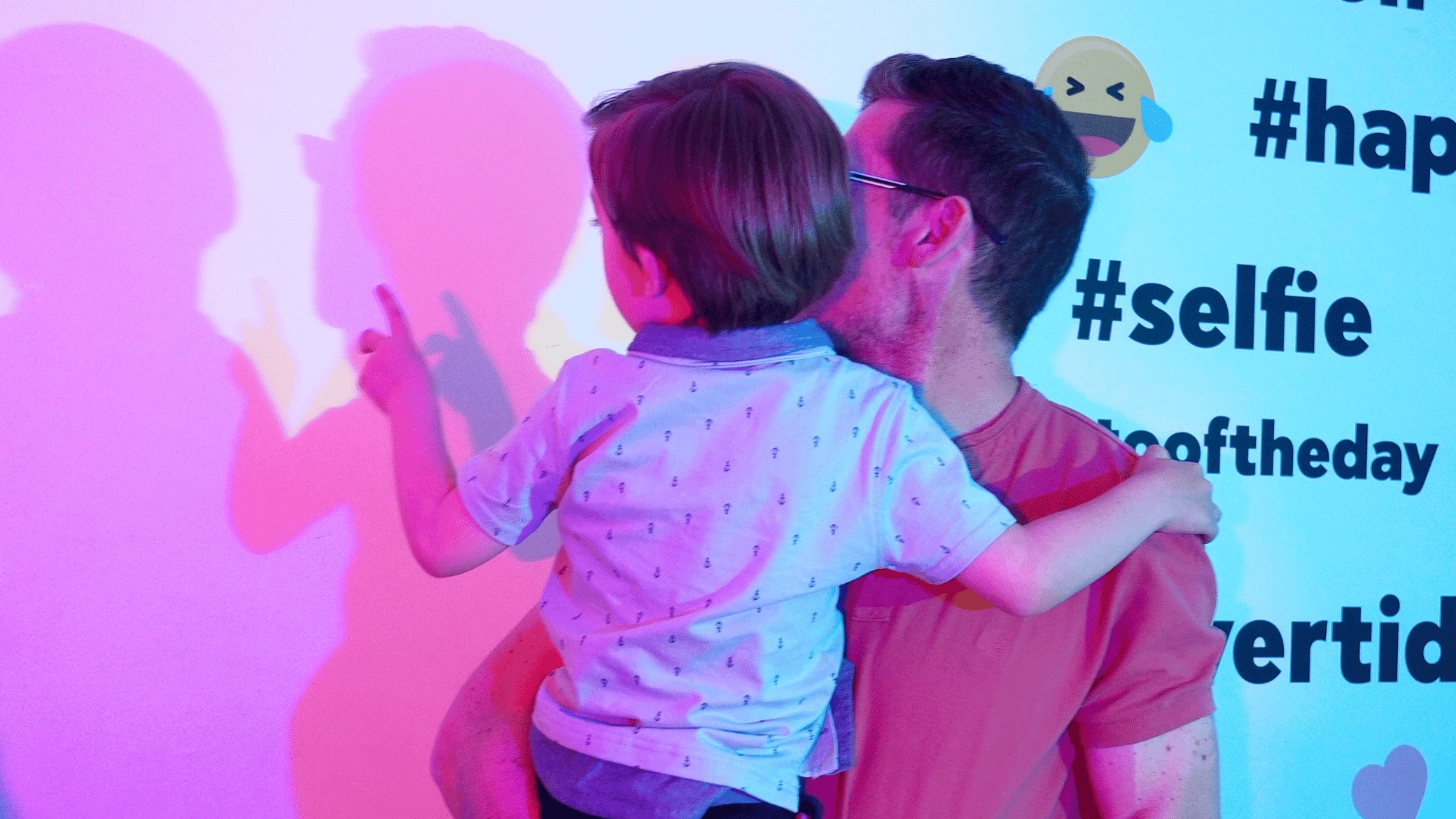
The Color Room: when the light changes, so does what you see
In the Color Room at the Museum of Illusions Madrid, this phenomenon is no longer limited to an image.
The lighting changes the colours we perceive inside the room and visually transforms objects and surfaces that stay exactly where they are.
The museum itself presents the experience as a demonstration of how light can change everything we see.
The explanation lies in the very nature of colour.
Objects reflect certain wavelengths of the light that falls on them. If the make-up of that light changes, so does the information that reaches our eyes.
The brain tries to compensate, but it doesn't always fully manage it.
That's why a familiar object can take on an unexpected look just by changing the lighting.
Where do we find this outside an optical illusion?
Much closer than you might think.
Photography and video
A camera has to interpret the colour of the light illuminating a scene.
That's where white balance comes in, which tries to stop a photo taken under certain lights from looking too blue, yellow or reddish.
The problem is very similar to the one our own visual system solves: telling the colour of the object apart from the colour of the lighting. Colour constancy has direct applications in image correction and computer vision technologies.
Graphic design and screens
The same colour can look different depending on a screen's brightness, its calibration or the shades around it.
That's why designers and imaging professionals don't just work with a single colour in isolation, but with palettes, contrast and context.
Fashion and interior design
The lighting in a shop can considerably change how we perceive the colour of a garment.
The same happens with wall paint, fabric or furniture when it moves from artificial light to natural light.
It's not necessarily that the object has changed.
It's the light our brain has to interpret it with that has changed.
Advertising and packaging
Placing one colour next to another can make it look brighter, more intense or less saturated.
That's why colour contrast is used to make products, calls to action, packaging and graphic elements stand out.
Is colour in objects or in our brain?
In reality, the colour we perceive comes from the interaction between light, the properties of surfaces, the receptors in our eyes and the processing carried out by the brain.
Objects reflect certain wavelengths, but the final experience of colour is built by the visual system.
That's why two physically identical stimuli may not look the same to us when the context changes.
And two different stimuli can, under certain conditions, look surprisingly similar.
Discover how light changes colours in Madrid
At the Museum of Illusions Madrid, the Color Room lets you experience first-hand how lighting transforms our perception.
It's one of the museum's immersive experiences, alongside other spaces that use light, perspective, reflections or movement to challenge our senses.
The interesting part isn't just seeing that a colour can change before your eyes.
It's discovering that the colour we think we're seeing never depends only on the object in front of us.